I think we tend to worry more about things that will kill us quickly, such as a huge truck suddenly coming at us at breakneck speed. We manage to put off thinking about the things that will kill us slowly, such as a bad diet or smoking.
Plus it’s contagious. I think that adds a different dimension to the public health/media response.
4 Likes
That assumes 10 fliers per flight.
In the UK from 1990-2000 the rate was 117 per billion flights.
0.000001%
Ten thousand times better than 0.01%
Your chances of dying by Space Shuttle flight were 2%
Traffic fatality really is something quite more worrisome without even needing to be hypothetical about it (though that has diminished for obvious reasons in recent months). It may be a more-or-less accurate mantra to think: “It isn’t the horrible stuff in the news that is likely to kill you. It’s the stuff that doesn’t make news any more.”
At the time NY was following CDC guidelines. Now NY is doing a spectacular job of fighting the virus with carefully phased reopening.
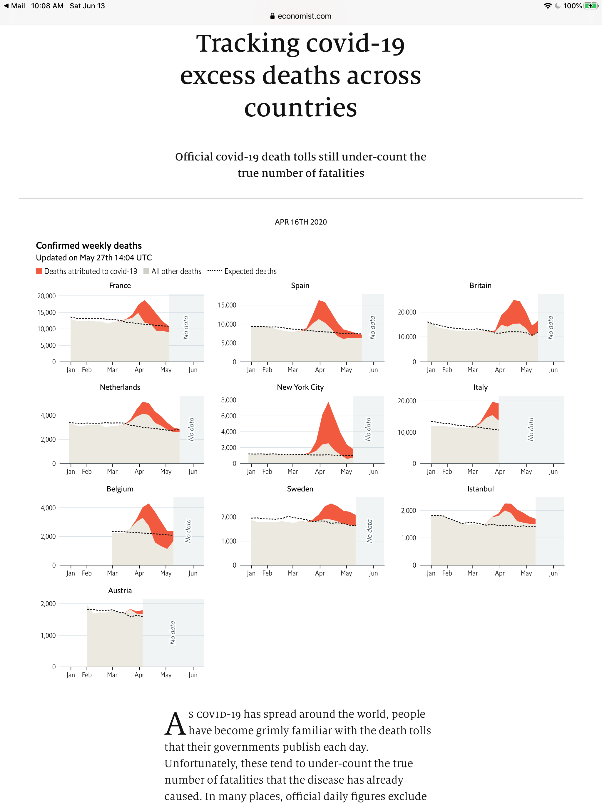
The excess deaths in New York City, according to these graphs from the Economist, indicate something went very wrong in NYC:
1 Like
Something went wrong. all right. Your article is tracking covid-19 excess deaths across countries. Well, New York City isn’t a country. Heck, It isn’t even a state. Besides, the article is from April 16!
btw, New York State is leading the nation in covid-19 reduction.
1 Like
Actually, it is showing the difference between total deaths and expected deaths in regions: two cities and several countries.
The relevant information is the area under the expected deaths line and the area under the upper line.
Note that the proportions of the areas across regions are quite different, with NYC having a much greater increase in COVID deaths than other regions.
Of course NYC is leading the nation in COVID reduction, since so much of the vulnerable population has died.
Not everyone knows how to read graphs, Try comparing the two cities, NYC and Istanbul. You should be able to see the dramatic difference. Normally, each city has about 1500 deaths per month. COVID drove Istanbul to less than 3000 and NYC to 7000. (I suspect some of the difference can be attributed to Istanbul’s population being younger.)
By the way, it is not from 4/16. Note it was updated 5/27.
Did you see this? Nothing like states manipulating stats to make reality seem different:
2 Likes
Note in post 46 that “reject-lockdown” Sweden is no worse than other places.
And “first out of quarantine” Georgia is doing well.
Not what I heard.
The country vastly outpaces its nearest neighbors in the confirmed cases and death toll linked to COVID-19. And it has not reached herd immunity — a threshold often pegged to around 60% of the population immune — as officials had hoped it would last month.
Did you see the Economist evaluation in post 46?
Yes, better protection for the most at-risk people (those in long-term care facilities) would have helped.
But that was not unique to Sweden. The NY governor forced such facilities to take sick people.
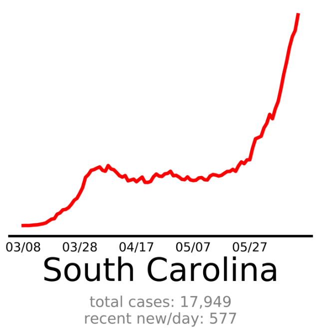
Actually, Vance, the first out of quarantine was South Carolina. Let’s see how the new confirmed cases graph is trending there:
Now let’s look at Arizona, which reopened on May 4:
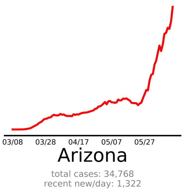
Notice a trend?
Let’s take a look at Arkansas, which reopened salons on May 6 and never had a statewide stay-at-home order:

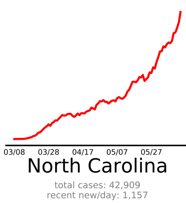
North Carolina, which reopened significantly on May 8 and almost fully on May 22:
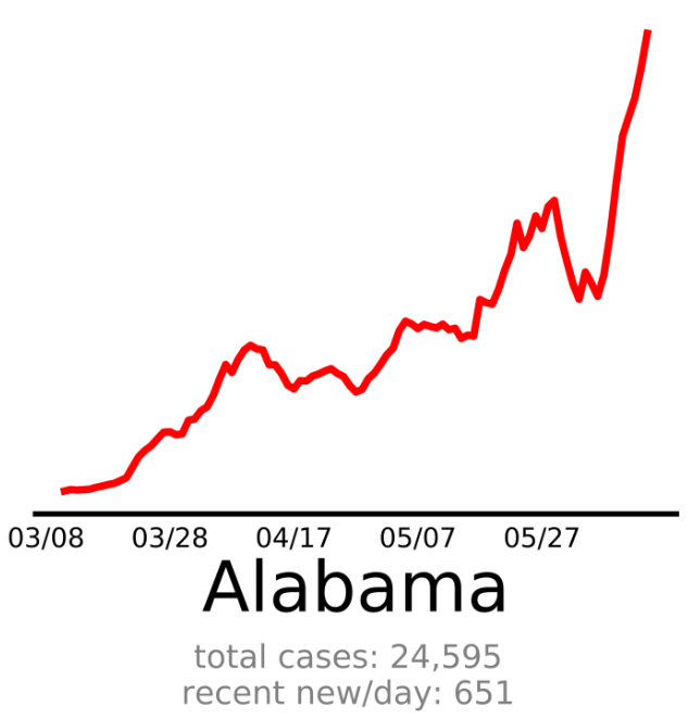
Alabama, where the state’s stay-at-home order to expired on April 30. Retail stores opened first; restaurants, salons and gyms on May 11; entertainment venues opened May 22.
Alaska eased many restrictions in late April, before Georgia, and fully reopened May 22:

Florida reopened significantly on May 4 and almost fully on May 22:

In Kentucky, houses of worship reopened in early May and most retail reopened prior to Memorial Day:

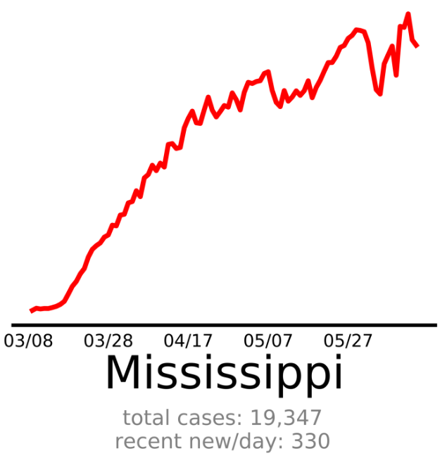
Mississippi’s stay-at-home order expired on April 27 and previously closed retail began reopening. The state fully reopened on June 1.
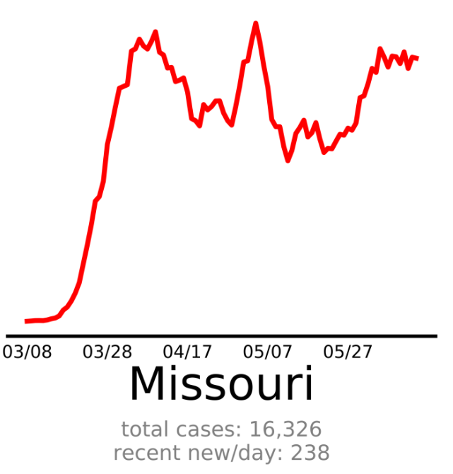
Missouri reopened almost all businesses and venues on May 4, although some large, indoor venues have seating restrictions. The graph shows the surge of new cases that occurred within a couple of weeks.
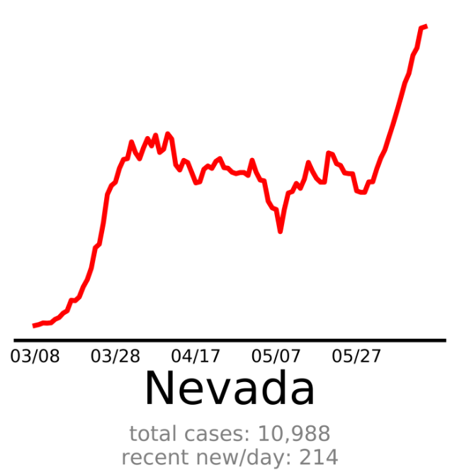
Nevada mostly reopened on May 9, and casinos reopened June 4. How has that been working?
Oklahoma mostly reopened on May 1.

Tennessee reopened (with some restrictions) restaurants on April 27, retail venues on April 29, and gyms on May 1.

Texas reopened on April 30, although it did place some seating restrictions on restaurants and large venues.

Utah never had a statewide stay-at-home order, and allowed gyms, salons, and restaurants to reopen May 1 (with some restrictions).

One thing all these states have in common is a lack of any mask regulations.
It is true that Georgia and Ohio are outliers by comparison. But it is very, very unwise to point to outliers when making an argument for an ethical choice or a governmental policy.
Best,
Chris Falter
My data source: https://www.endcoronavirus.org/
6 Likes
Chris,
“New Cases” are heavily influenced by the amount of testing, so as testing increases we expect to see more new, confirmed cases.
Hospitalizations is likely a better measure.
“Total Deaths” is also likely a better measure, although comorbidity must be taken into account.
The website you linked certainly has an aspirational goal.
COVID-19 hospitalizations have been increasing in almost all of the states under discussion
As of June 9, hospitalizations are increasing in 9 of the 15 states cited above:
- Alaska
- Arkansas
- Arizona
- Kentucky
- Mississippi
- North Carolina
- South Carolina
- Texas
- Utah
In the past few days they have begun increasing…
In Alabama:

In Florida:

In Tennessee:

In Texas, although not rapidly. (I believe this is driven by Houston; other areas of the state are more stable.)
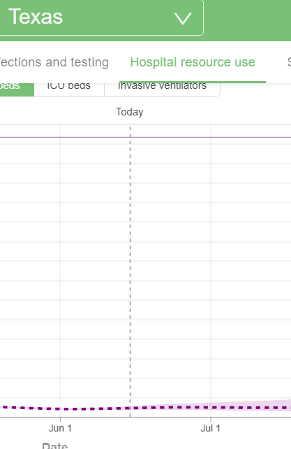
Note: all graphs are from the Johns Hopkins COVID-19 site. They are historical up to present date and estimated into the future based on their metapopulation SEIR model.
Best,
Chris Falter
I’m not sure if those graphs came through too well. Maybe the scaling on the y-axis could be adjusted?
Those graphs are mostly projections. The increases in the measured data look minuscule in the graphs. And with such a small increase, the 6 states not increasing are relevant too.
That broad range to the right of the vertical “Today” is at best questionable modeling and at worst…
But hospitalizations should be increasing, Chris. That was the plan from the beginning:
Flatten the curve so as not to outstrip hospital beds and medical resources while capabilities are expanded, then loosen the restrictions when the medical system was ready.
The plan was not to destroy the economy with months and months of shutdown.
Again, at the time Gov Cuomo was following the advice of the CDC. He reversed this ruling. His mother is in a nursing home. NY reopening is going well for the most part. Cases still going down, despite reopening.
But you don’t even want to wear a mask?
Are you certain the CDC said to send COVID-19 positive old people to long-term care facilities where they could infect others?
I doubt that!
There are nursing homes where the covid-19 patients are isolated from the other ones and it works. My dad is in such a facility here in Connecticut.