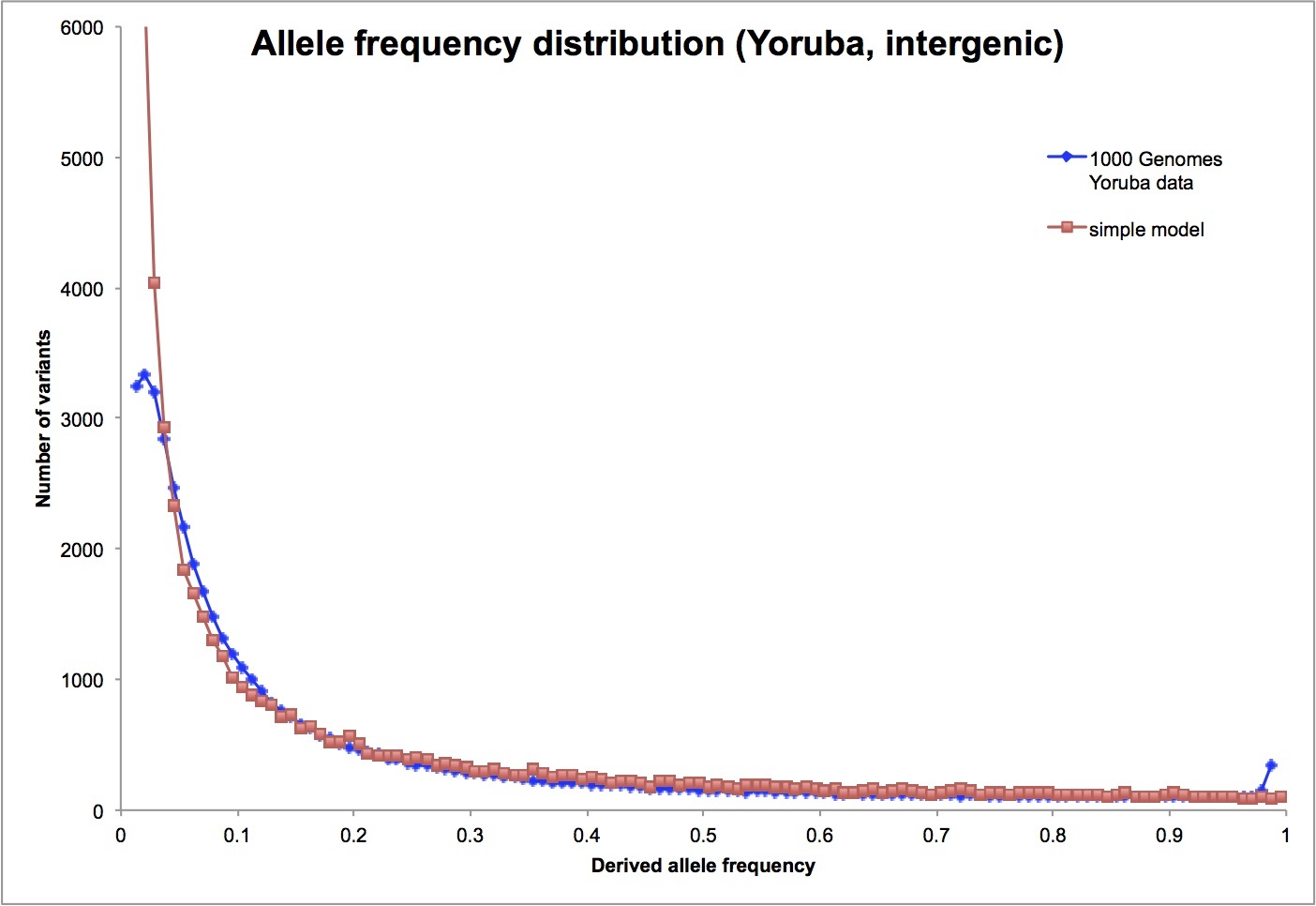
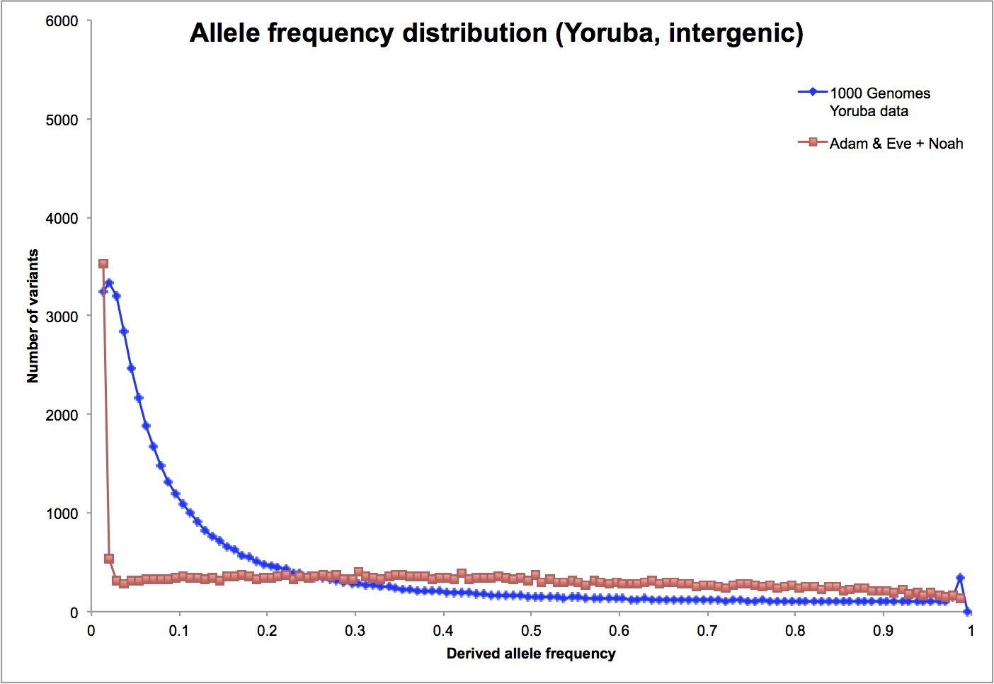
I finally got around to playing with this some more. Here’s what I did. . .
I simulated two demographic histories for humans, one a conventional history as understood by science and the other a young earth model with a recent first couple and global flood. I used the same mutation rate for the two models: 0.2 mutations/genome copy/generation, which is equivalent to simulating ~0.5% of the genome. I assumed 25 years per generation. For both models, I sampled 60 individuals from the end population to compare to the 60 individuals in the 1000 Genomes data I previously posted.
The conventional model has a long-term constant-sized population of 15,000. 75,000 years ago the population started expanding exponentially until it reached 100,000 in the present. (The entire population is obviously much larger than this, but it isn’t a bad approximation for a local population a few thousand years ago. The rapid expansion post-agriculture only affects very rare variants, and will have negligible effect on the data I’m looking at.)
The YEC model 241 generations ago. It begins with a population of two, and doubles every generation for the first 10 generations, then expands more slowly, at just over 2% per generation. After 66 generations I reduce the population size to five, to model Noah, his wife and their three daughters-in-law. Then comes another 9 generations of doubling, followed by 2% growth again. This leads to the same final population size as the conventional model, 100,000. I added enough genetic variants to the original couple to make the two models have the same overall genetic diversity in the modern population (measured as the average number of pairwise differences). To make the initial variants look as much like the real data as possible, I assigned half of them one copy of the derived allele, a third two copies and a sixth three copies.
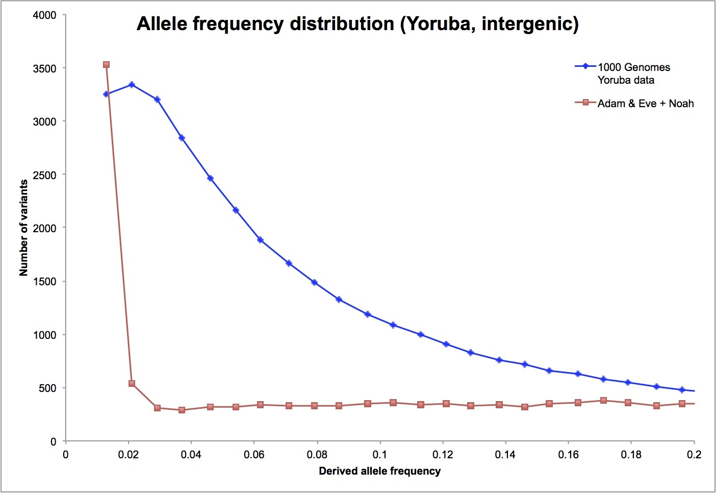
Here’s the comparison with the 1000 Genomes data (with the latter scaled down to match the simulated level of variation).
Thanks for putting in the effort for your graph. Unfortunately, I am not as schooled in the science of biology as genetics as many of you, so I’m confused It looks like the graphs are very similar, and therefore, it may be argued that the genetic data we have does not necessarily disprove a single pair of progenitors starting life as we know it. Is this a correct understanding? If so, what assumptions have to go in to the original pair and Noah’s family and are these assumptions realistic?
Do the blue and red lines look similar? The blue line is telling us that there are lots of genetic variants that are present in 5% or 10% of humans. That is, if you look at the DNA of a roomful of people, you’ll find lots of places in the DNA where a couple of people in the room share a mutated DNA “letter” there. (And by lots I mean hundreds of thousands of places.)
The red line tells us that a recent Adam (and Noah) couldn’t produce that pattern. There have been too few generations since Noah to accumulate a lot of new mutations (the new mutations are the spike at the left side of the graph) and no way to get them to 5% frequency. Any genetic variants already present in Adam and Eve will occur at all kinds of frequencies – in 10% of the population, 20%, 50%, whatever. Those variants are the flat red line across most of the graph.
The most important assumption I made in creating the red line was that the mutation rate has been constant throughout our recent history.
Thanks for the explanation, I must have been confused by the data. So, what is the practical explanation for the middle of the graph? At point 0.06 for example. Blue line is at 1800 approx, and the reddish line is at fewer than 500. What does it mean? Unfortunately, I have zero schooling on this so imagine that I’m an inquisitive 15 yo
Your inquisitiveness has already developed from that of someone aged 5 years to that of someone aged 15 years since the moment you started this thread. So it appears the answers people provided here did help you with your questions .