They were what?
And what do you think this graph is telling you about a massive rise in sea level? Presumably the black curve is the average temperature anomaly and I have no idea what the different colors are meant to represent but it doesn’t show anything related to a massive rise in sea level that would have killed all those barbaric hunter folks but preserved the more civilized like farmer Noah.
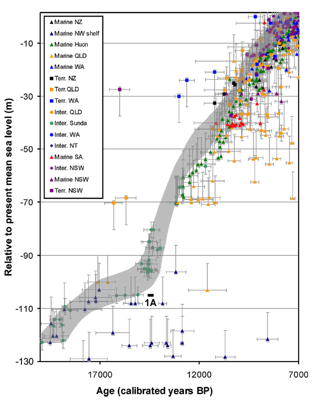
Here is a graph from Australia for example:
And from various parts of the world (South America/Central America/etc.):
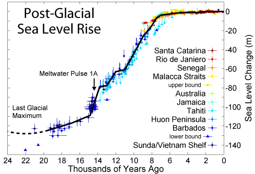
There is no sudden spike at 8,500 years ago but a gradual rising of sea levels over several thousands of years.