Your sample was 5 states drawn with a clear bias. The sample I cited was all 50 states.
Answer me this, Vance: Do you know of any way I could draw a larger sample of states under the same geopolitical considerations as the 50-state sample I cited?
(1) Actually, I’m not sure it would. There are thinly populated states like Maine and North Dakota that have vastly different mask usage. There are also more densely populated states like Louisiana and Maryland that have vastly different mask adherence.
(2) Your assertion is 100% speculation until you actually do some work and draw a graph.
(3) I have no idea, based on what you have written, how whatever correlation between density and mask usage exists (or doesn’t) has anything to do with COVID-19 prevalence this week.
(4) Clustering factor is vastly more important that gross population density as a determinant of disease propagation. For example, Arizona is quite thinly populated by average density, but over 76% of Arizonans live in just two counties (Maricopa and Pima). Because clustering factor is enormously more important than gross population density, I seriously doubt anything is to be gained by a state-wise analysis by gross population density.
You guys need a remedial lesson in reading fine print, and your assumptions about my character and intelligence need some remediation, too.
But the cost of running one such survey for all 50 states plus D.C. would be enormously prohibitive — to say nothing of doing so on a daily basis, which is necessary to produce the kind of real-time data of interest to epidemiologists.
So the CovidCast team partnered with Facebook, which is used by 70 percent of U.S. adults and has the ability to survey tens of thousands of them every day at relatively low cost. While the resulting state-level samples aren’t perfect representations of the general population, the researchers weight the responses using Census Bureau demographic data to ensure they’re a good approximation.
I am quoting from the article I linked to in the original post. Were you diligent enough to read it carefully?
My mentioning those 5 was not a presentation of those as a sample. There were examples of points on the graphs to show the point that I was trying to make.
And I said it might, which means I am not sure it would.
You have misread my posts on this thread several times, and they were not in fine print.
Sampling is roughly synonymous with selecting. Po-tay-to, Po-tah-to.
But you seem to agree with me that your method for taking a convenience sample making a haphazard selection of 5 states does not provide a basis for drawing any conclusions, so let us move on.
Let’s test the viability of drawing a completely different conclusion from this graph, just for the sake of understanding.
Observations:
There is a correlation between mask wearing and knowing a person with Covid-19 symptoms.
Where about 40% of the people know a person with Covid-19 symptoms, about 70% of people wear masks much of the time
Where only 15% of people know someone with Covid-19 symptoms, about 90% of the people wear masks much of the time.
Knowing people with Covid-19 symptoms decreases the likelihood that people will wear masks.
Conclusions:
People who know others with Covid-19 are less concerned about Covid-19 and therefore are less likely to wear masks because they understand the disease is typically mild from personal experience
People who don’t know others with Covid-19 are more concerned about Covid-19 because their information on the disease’s severity is coming from the news media or other sources that may be exaggerations
This graph does not provide strong evidence for mask wearing. This graph provides evidence that a more personal understanding of the disease decreases the perceived need for wearing masks.
Caveat: the data set was acquired from Facebook posts and surveys and therefore may not be a rigorous foundation.
For observation 1, I would have said anti-correlated; r is negative.
One could draw these conclusions if residents of all states know the same proportion of people as any other i.e New Yorkers know and are in communication with several times more people than North Dakotans . This is an implicit assumption that also makes the more masks–>less infection conclusion suspect. A better graph would be hospitals admissions per capita vs mask wearing, assuming that facebook data does not have self selection or non-anonymity biases
One of the biggest failings of the graph in my opinion is that it tries to present information based on people knowing someone with Covid now, rather than recognizing the different histories of this pandemic in different areas.
Certainly the April/May experience of the Northeast is an unaddressed factor.
And my fourth observation might better be called a conclusion.
Masks Do More Than Protect Others During COVID-19: Reducing the Inoculum of SARS-CoV-2 to Protect the Wearer (JOURNAL OF GENERAL INTERNAL MEDICINE 35, 3063–3066 (Published July 31, 2020).
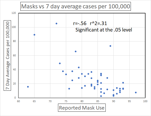
I went through the CMU Covid Cast data and made a correlation of masks vs 7 day average cases which avoids any assumptions of how many people each individual knows. The correlation is not as good but is above the 0.05 level so one should accept it as valid. There are more outliers indicating that there are other factors.
It should be noted that the mask data is mostly in the 70 to 90% range so most Americans are wearing masks even in the states receiving scorn for not doing so
Thanks, Ronald, that is helpful, and I appreciate the effort.
I suppose we could conclude
there are fewer cases where people wear masks
or
fewer people wear masks where there are many cases.
With the former, there is an indication masks protect people.
The latter gives an alternative conclusion that personal familiarity with the disease decreases mask use.
There may be some unmasked people at Trump rallies embracing the second option: that President Trump, an overweight man in his 70s got the disease and bounced right back in about a week so the disease is not the scourge that some say it is. That may be a simplistic view, but it may be held by some.
I will go with conclusion 1 and expect that those places where fewer masks are worn, more will be worn as the 1 in 30 cases death toll rises.
With respect to Trump’s fast recovery: he is overweight and in his 70’s but his campaign schedule, before and after illness, suggests significant vigor and that he is more healthy than most think or wish. Few 70 year olds can manage a 40 hour work week muchless a 60 hour so his experience cannot be considered typical