I implore you @wbwane to take a pause and see what you are doing here. You are a smart guy, but it looks like something is preventing you from accurately understanding climate science. What is it? Your last three posts have all been off in the same way.
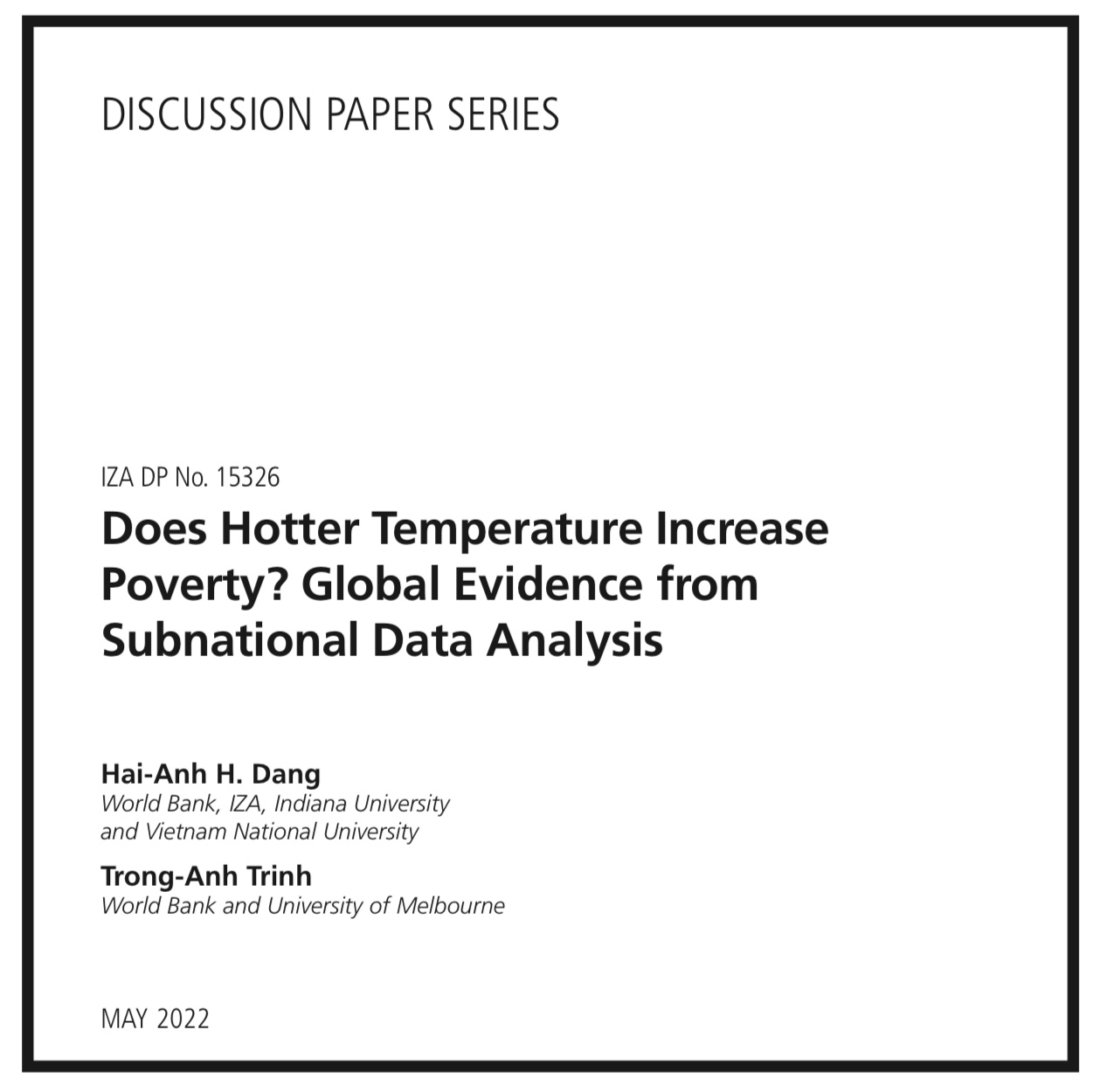
The Problem with These Graphs: They Show 2% of Earth
These graphs show Alabama and the Midwest US - about 2-3% of Earth’s surface. That’s the entire trick.
What the global data actually shows:
2024 was 2.65°F (1.47°C) warmer than the 1850-1900 baseline. The 10 warmest years on record have all occurred in the last decade (see NASA Science).
In the 1930s? The US was hot, but the planet as a whole was much cooler. When you compare 1930-1939 to 2010-2023 globally, most of the planet shows dramatic warming in the recent period:
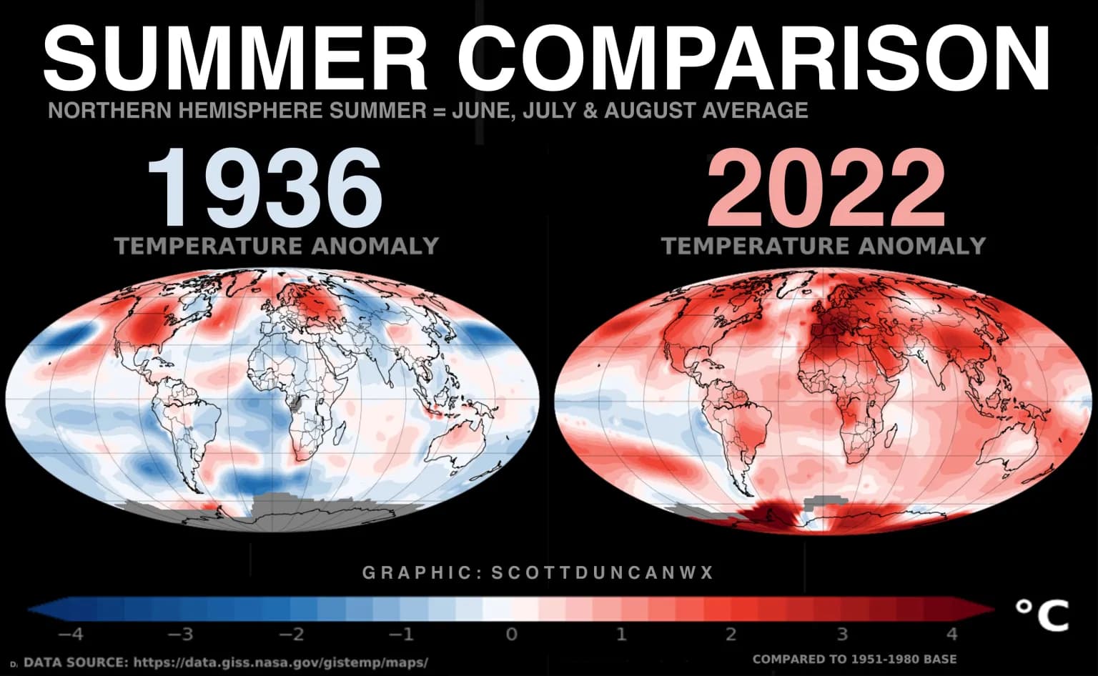
(see this for a discussion on the 1930s heat wave in the midwest: WFLA).
Why was the 1930s US so hot?
The Dust Bowl wasn’t natural - it was caused by “plowing up the middle third of the U.S.” and removing native grasslands. This human-caused land destruction generated extreme regional heat.
Climate models can only reproduce the 1930s US heat when scientists add in the massive devegetation that actually happened. Models match global temperatures extremely well - they just don’t predict every local quirk from land-use disasters.
About those state temperature records:
This is confusing climate (long-term trends) with weather (individual extreme days). Climate change doesn’t mean every single location breaks its all-time high every year.
Climate models are designed for global predictions, and they nail it. Judging them by Alabama’s summer temperatures or whether Iowa broke its 1934 record is like judging a US weather forecast based only on whether it got Tucson right.
Why cherry-pick a handful of states instead of looking at the whole planet? Because the global data - from NASA, NOAA, and every major scientific institution - shows exactly what physics predicts: rapid warming tracking with greenhouse gas increases.