I doubt it. Both seem important.
I didn’t realize that agriculture was a normal part of nature that didn’t come from human intervention.
1 Like
Methane is a potent greenhouse gas on a per mole basis. It currently appears to contribute about 20% of anthropogenic warming (graphs also here). On the plus side, its lifetime in the atmosphere 1-3 decades. Industry, agriculture, waste and fossil fuel extraction are contributors and there is potential positive feedback with warming contributing to increased output from wetlands and melt areas. Atmospheric methane concentration vs time here.
Also, like with CO2, current methane concentrations are not ‘saturating’ for heat retention capability.
1 Like
Temp: Parker DE, Legg TP, Folland CK (1992) A new daily Central England Temperature Series, 1772 – 1991. Int. J. Clim., Vol 12, pp 317–342, Met Office Hadley Centre observations datasets
CO2: Boden TA, Marland G, Andres RJ (2016) Global CO2 emissions from Fossil-Fuel Burning Cement Manufacture and Gas Flaring 1751 – 2013. CDIAC, Oak Ridge National Laboratory, U.S. Dept of Energy, Oak Ridge, TN, USA, DOI 10.3334/CDIAC/00001_V2010
Source(s):
Source(s):
Source(s):
Source(s): Milankovitch cycles - Universe Today
Source(s): NASA: Milankovitch (Orbital) Cycles and Their Role in Earth’s Climate ,

As many, maybe most, climate models say should have happened due to human activity.
You keep pretending that things that conform to the models contradict the models. The only conclusion I can come to is that you’re parroting things others have said and haven’t actually investigated things for yourself.
I’m sure that it wasn’t just at OSU that people noticed the retreat of glaciers a few centuries ago, looked for correlations, and saw that human activity fit the pattern.
1 Like
Thank you for the links.
Just make ONE claim will you Bill? One consilient claim. Got one? Please?
One that real, honest, objective, non-partisan, scientists, like you used to be, agree on.
AND . WHAT . ARE . WE . GOING . TO . DO . WHEN . THE FOSSIL . CARBON . IS . ALL . GONE ?
1 Like
Fair enough. For a long time, carbon was thought to last for 300 years. Now with the new mining and drilling techniques, maybe 500 years. Nuclear Fission power using the Thorium breeding will be useful for many hundreds of years. The best Thorium deposits are in India…for what it is worth. There is a lot of talk about fusion. From my perspective, the laws of physics are not favorable. And, it some places, techniques may be developed to take great advantage of of geothermal heat.
Notice that the bulk of the melting for Glacier Bay occurred well before 1960 when carbon dioxide levels were becoming noticeable.
Consilient links? Not bad science. We have 100 years of carbon. Then what? There is no thorium cycle. Uranium runs out in less.
The sun and the wind and the waves and the tides won’t. Ever.
Fusion is fantasy.
I think people have already told you, but one more time and I’ll leave it. Milankovitch cycles are explained here:
Another reference: “Saving Us” pg. 44, Dr. Katharine Hayhoe, Climate Scientist.
In a nutshell, the current Milankovitch cycle direction is cooling, yet the world is warming.
3 Likes
This post is really not for you @wbwane , but for others looking on. I’m confident you will not bother to budge from your position as you continue to cite misleading graphs from the CO2 coalition, despite being corrected multiple times. We’ve Even seeing the trick in the first graph before, through your misleading graphs from a local region of the Midwest, but apparently, you didn’t learn anything. So anyways…
For anyone following along - here’s how to spot deception in climate graphs. These two are textbook examples:
Graph 1: Central England Temperature (CET)
Red Flag #1: Regional data masquerading as global
CET represents a region enclosed by Lancashire, London and Bristol - roughly 0.002% of Earth’s surface. Using one tiny region to make claims about global climate is like judging US weather by checking only Phoenix.
Red Flag #2: Heavy smoothing hides recent warming
In the CET series, nine out of the ten warmest years have occurred since 1990 and the top five have all occurred since 2006. 2022 broke the record at 1.68°C above the 1961-90 average. This 11-point smoothing obscures this acceleration.
A more accurate graph would be something like this:

Red Flag #3: Ignoring the actual CET scientists
Studies using CET have shown that for the United Kingdom the observed warming trend can be attributed to anthropogenic climate change. The scientists who maintain this dataset say it shows human-caused warming - but CO2 Coalition cherry-picks the data while ignoring their conclusions.
Graph 2: Temperature Reconstruction Ending in 1949
Red Flag #1: LOOK AT THE ENDPOINT
“Most recent data: 1949”
They cut off the graph 76 years ago - right before the dramatic warming period. This is like showing someone’s finances through October 1929 and claiming the crash didn’t hurt them.
Red Flag #2: It’s already-debunked data
This is the same Loehle 2008 reconstruction with known problems:
-
Climate scientists found only 5 of 18 proxies were suitable
-
Loehle himself didn’t claim that it is a valid representation of global temp
-
Had dating errors requiring a correction paper
Red Flag #3: What they’re hiding
Global temperature in 2024 was 2.65°F (1.47°C) warmer than the 1850-1900 baseline, and the 10 warmest years on record have all occurred in the last decade.
Their graph shows Medieval Warm Period peaked around 0.5°C above baseline. We’re now at ~1.5°C above pre-industrial - roughly 3 times warmer. If they extended to 2024, it would shoot off the top of their chart. Something like this:
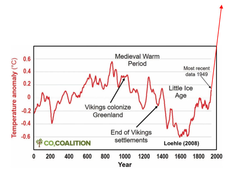
Red Flag #4: The claim refutes itself
They say warming is “neither unusual nor unprecedented” while showing data that stops before the unprecedented warming.
The Pattern Across Both Graphs
Notice what CO2 Coalition keeps doing:
-
Graph 1: Regional data (0.002% of Earth)
-
Graph 2: Stops 76 years ago
Both hide the same thing: modern global warming
Questions to Ask When You See Any Climate Graph
-
What year does it end? (If before 2000, ask why)
-
Is it regional or global? (Earth has a surface area)
-
Who made it? (CO2 Coalition = fossil fuel funded)
-
What do the actual scientists say? (Not what lobbyists say)
Bottom Line
They’re betting you won’t notice:
-
Graph 1 shows 0.002% of Earth
-
Graph 2 stops in 1949
Meanwhile, global data from NASA, NOAA, and every major scientific institution shows the warmest decade on record, with warming rates and absolute temperatures unprecedented in the proxy record they partially show you.
This isn’t skepticism. It’s strategic deception.
10 Likes
Matthew, thank you for the comparison and explations!
I still have questions and an observation
The Modern Warming graph ends at 2009, cutting off valuable data.
Never had stats. But I have a lot of experience with averages. I want to make sure I understand the difference in the way the averages work in the two graphs. This is what I understand:
In order for either graph to show the size of the variation of temperatures, there has to be something temperature they vary from - an average. So, ideally, we’re looking at variation from what is “normal” for the purposes of the grahps. But the two graphs use different types of averages.
I had not noticed the note about 11 poing smoothing in the Modern Warming graph. Google helped me understand what that meant:
The most common and simple method for an 11 point smoothing is the unweighted sliding-average smooth (also called a box filter or moving mean). For each point in a data series, the process is:
- Define the window: An 11-point window is centered on the data point to be smoothed. This window includes the target point, five points immediately preceding it, and five points immediately following it.
In other words, the average from which the temperatures vary in the Modern Warming graph are changing along with the temperatures. So, what would be considered “normal” at any point on the graph is changing with the data itself.
This makes any kind of absolute comparison challenging at best.
The Central England Mean Temperature graph uses a single 30 year average (1961-1990) to establish a fixed “zero” on the y axis. In this case, the shape of the graph wouldn’t change no matter what 30 year span was used to create the baseline. The difference would be the location of zero on the y axis.
Did I understand correctly?
What are Data Custodians?
That’s all I have time for now.
THanks for all your work on this thread.
4 Likes
On Smoothing vs. Baselines
Both graphs use both:
Baseline = What does “zero” mean on the y-axis? (Sets where the line sits vertically - just shifts the graph up or down but doesn’t change the shape) Smoothing = Reducing year-to-year noise to show long-term trends (Makes the line less jagged)
What Does “11-Point” or “21-Point” Smoothing Actually Mean?
Think of it like this:
- Raw data: The temperature for 1990 is just… the temperature for 1990. Jagged, jumps around year to year.
- 11-point smoothing: Instead of plotting just 1990’s temperature, you plot the average of 11 years centered on 1990 (1985, 1986, 1987, 1988, 1989, 1990, 1991, 1992, 1993, 1994, 1995).
- Then you move to 1991: average the 11 years centered on 1991 (1986-1996).
- Then 1992: average 1987-1997. And so on…
- The result: Year-to-year wiggles get smoothed out. You see the underlying trend more clearly.
- 21-point smoothing: Same idea, but uses 21 years instead of 11. Even smoother, but loses more fine detail.
Why This Matters for Spotting Deception
Smoothing isn’t inherently bad - scientists use it to reveal long-term trends. But heavier smoothing makes rapid recent changes look gradual. You can make the data look quite different by changing this parameter, similar to if you’ve ever made or seen histogram binning. It’s somewhat arbitrary what you set the width of each bin to and the data can look quite different depending on how you do it!
Example with made-up data:
-
1980-2000: temperatures wobble between 14.8°C and 15.2°C
-
2000-2020: temperatures shoot up from 15.0°C to 16.5°C
With heavy smoothing (21-point): The 2000-2020 spike looks like a gentle slope starting in ~1990 With light smoothing (5-point): The 2000-2020 spike is obvious and dramatic
Both are mathematically valid. But CO2 Coalition consistently uses heavy smoothing that makes modern warming look unremarkable!
What Are Data Custodians?
Just a term that is generally used in IT that I’ve since gotten rid of in the post. Basically it was supposed to mean the scientists/institutions who collect and maintain the actual datasets.
Examples:
-
CET data: Met Office Hadley Centre (UK)
-
Global temps: NASA, NOAA, UK Met Office
Why this matters: CO2 Coalition uses CET data from the Met Office, but the Met Office says “when you look at the series as a whole it is clear that recent decades are warmer than any time in the past 360 years, and we expect further warming this century.” And the warming can be "attributed to anthropogenic climate change.”
The pattern: They cherry-pick the data while ignoring what the scientists who actually collect and analyze conclude about it.
7 Likes
Another issue with the CET graph: it shows a 300-year trend line, and claims the trend occurred over the entire 300 years. But you’d get the same 300-year trend line if the warming occurred only over the second half of the data, or only over the first half of the data. To show that the warming had been going on for 300 years you’d need to multiple trend lines, e.g. one for each century, showing that warming occurred in every section of the data.
Looking at the graph suggests that a trendline up to 1850 and a trendline after 1850 would have very different slopes. Especially if the first trend line started at the beginning of the data instead of 30 years in like the one shown.
Analysing this chart is like playing Darrell Huff bingo.
3 Likes
So Bill, we run out of oil, uranium, gas, in that order, this century and coal the next. How are we preparing for that? Apart from the billionaires? You all shill for?
Is this false news? For your buddy Vijay especially?
1 Like
Matthew, thank you again for yet more work helping me out.
I should have copied the graphs I was referencing rather than relying on the descriptive “titles”. When I asked this:
I was referring to the graph you had shared as an example of a more accurated depiction of the data. This one:
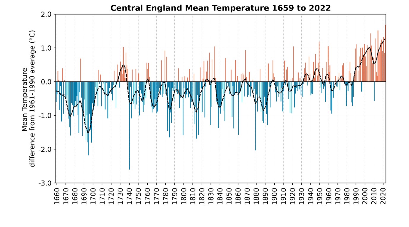
On the y-axis it’s labled "Mean Temperature difference from 1961-1990 average. There is a point plotted for each year in the data series.
I looked at the website, and it described the data in this way:
The Central England Temperature (CET) series is the longest-running instrumental temperature series in the world. By collating and combining early instrumental records, the series charts monthly temperature statistics from 1659
Although I couldn’t find more detail, it seems like the data plotted on this graph is the variation of each annual average temperature from the baseline.
The baseline in this graph is established to be the average of temperatures between 1961-1990. The choice of baseline seems sensible, as it would be what many readers of the graph would understand to be “normal” in their lifetimes.
I don’t see any explanation on the graph or the related webpage that explains how the data indicated by the black, dotted line were calculated.
I don’t know why we bother, the American plutocrats, the oligarchs, have won. They control the media. They have convinced the working class that they can provide the cheapest quality of life for now. There can be no restraint of that. As with AI. The only hope is China. India won’t do a thing until a million extra people die in one winter in their cities. And even then not. Not enough people can die and make a political impact anywhere.
Meanwhile Putin cancer eats Ukraine.
When the carbon runs out, the ruling class will THEN go flat out with sustainable energy, as there will be no choice.
1 Like
Because we, including you, care.
Because the near future you describe is abhorent and should be resisted.
Because we have changed ourselves, we know others can.
If we fail, at least we tried.
3 Likes
No WEIRD world electorate majority is going to vote for more expensive, i.e. morally responsible, enlightened self interested energy.
And no serious liberal political party will run on that. Ever again.
Look at the way the, by definition, flawed democracy of the US passes budgets. Down to the wire and over and way past it.
Oil, gas and uranium all run out this century. Coal next. That’s SEVEN degrees by 2125. Sea level will be up over 8 feet. All the current plutocrats will be dead by then, may be… Their heirs will carry on burning everything that can burn. Like Canada. THEN they will scream for sustainable energy, with 100% tax relief, AND more, for their $quadrillion investment. TEN degrees by 2400 regardless. Sea level 33 feet a century before, and rising by thermal expansion.
Resistance is futile, as the Vogons say.
Democracies cannot change. Until it’s nearly too late and at obscene cost.
The US barely survived the 4 year war to overcome secession over slavers’ rights. It cost a million dead.
WW2 was 2 orders of magnitude worse, in 6 years.
There is no trying.
Sorry! : )
CapitalistsRus.