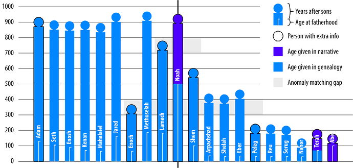
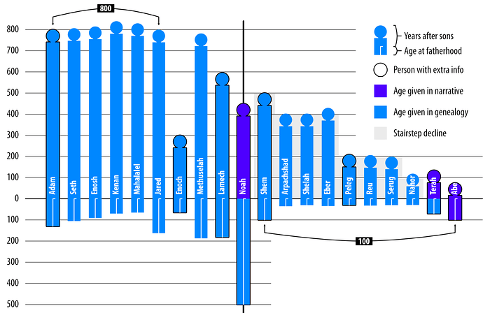
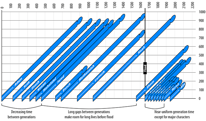
Okay, I have too much time on my hands, but I think this might come in handy for a chapter in a project I’m working on. Anyway, here are three charts, the first two to expose some of the patterns, and the third to show what the data looks like as actual lifespans over time.
In the charts, I’ve drawn each person using two numbers, their age when their son is born (feet to loins), and their age afterward (loins to head). The first chart zeroes each person at their birth so it’s easy to compare total ages, while the second zeroes each person at their son’s birth so that both numbers given can easily be seen.
In this third chart, you can see total age on the y axis, while the x axis shows the progression in time. By looking down each vertical line, it’s easy to see who would all be alive at the same. This also shows how the ages change over time (rather than over numbered generations).
(Edited to fix some things on the charts.)


